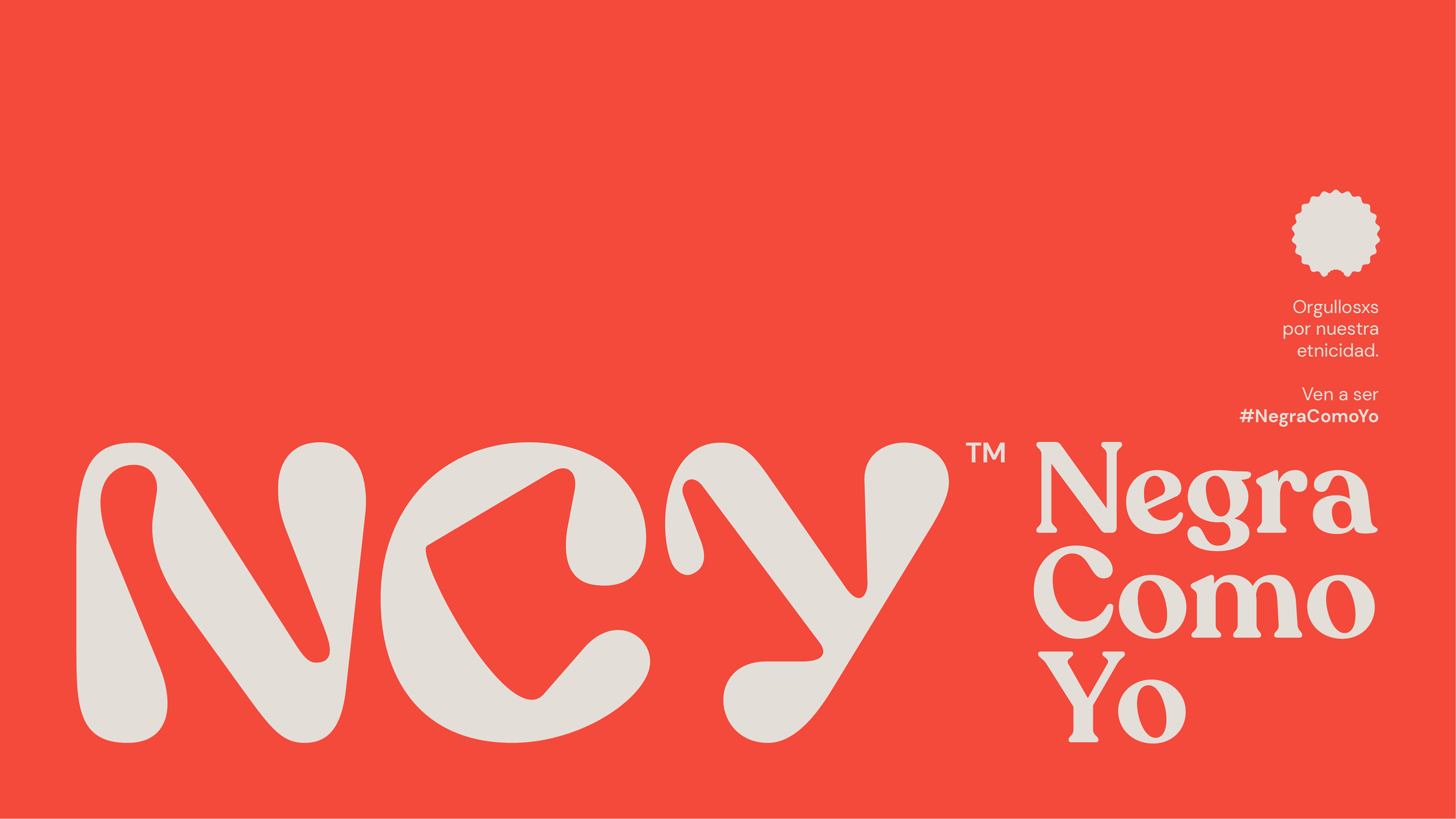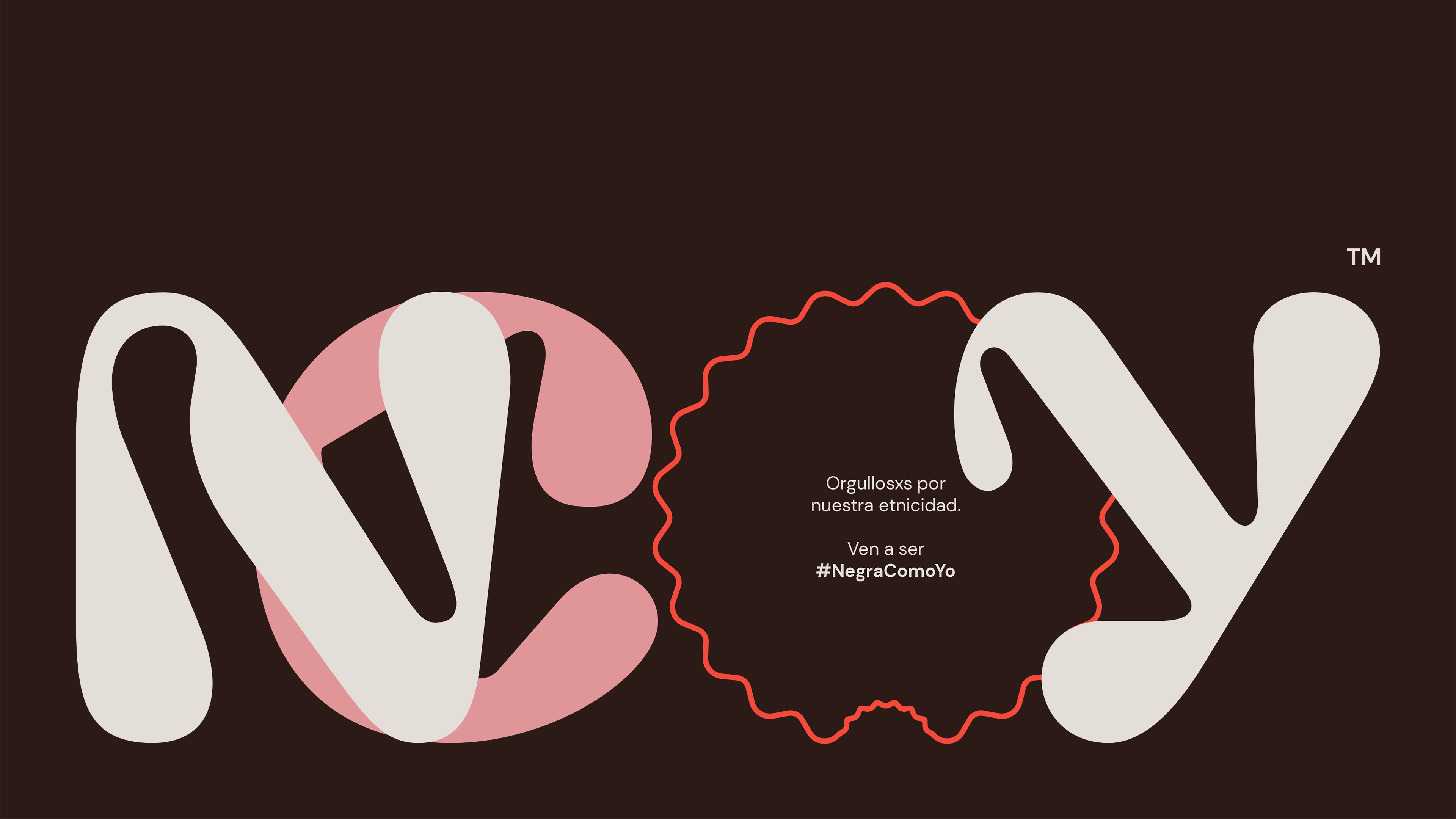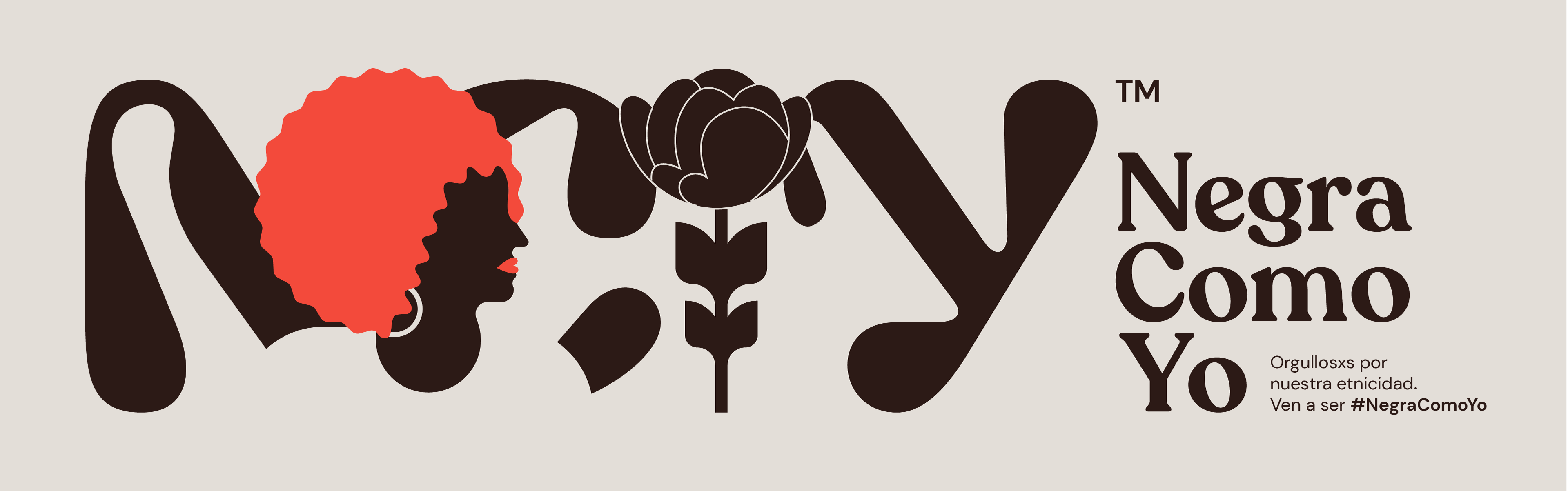
Negra Como Yo: Rebranding
Services: Visual Identity, Art Direction, Digital, Social Media
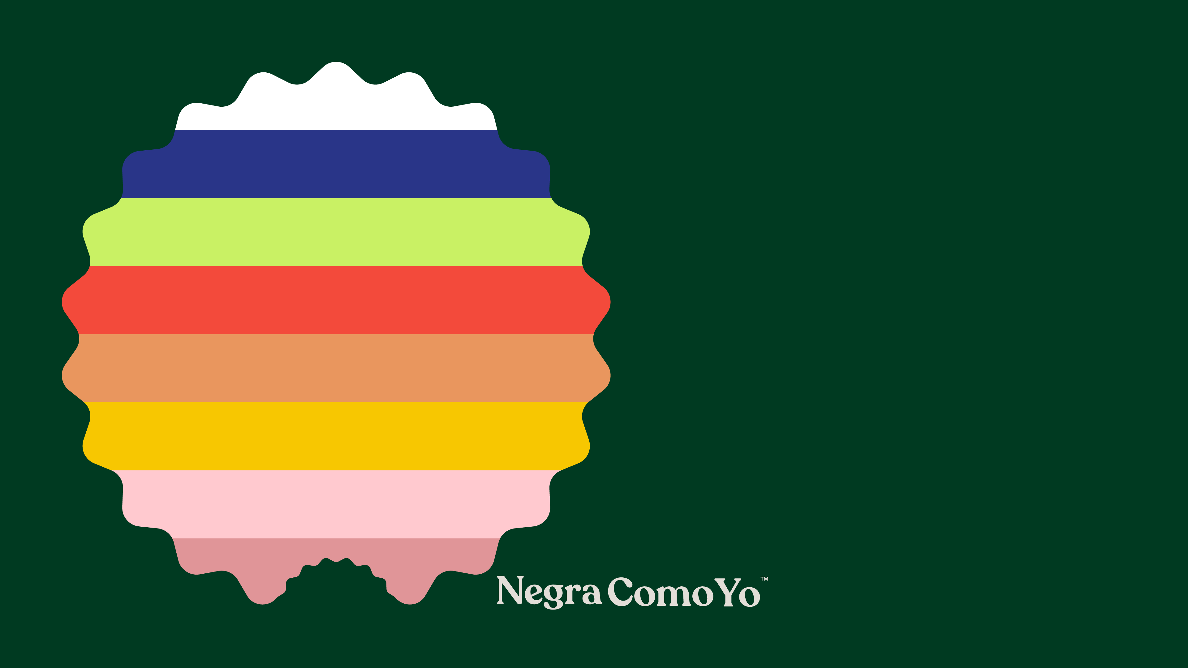
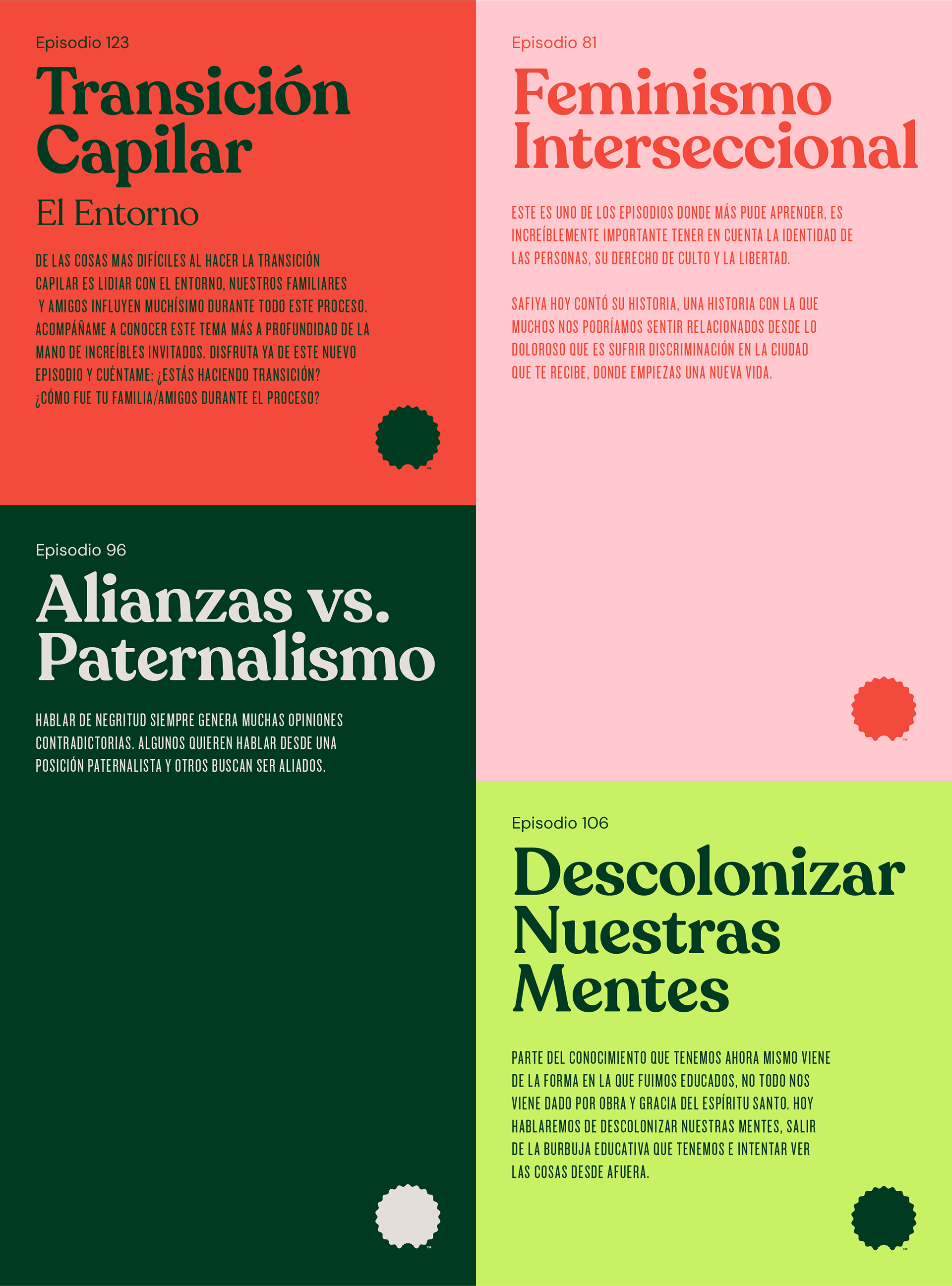
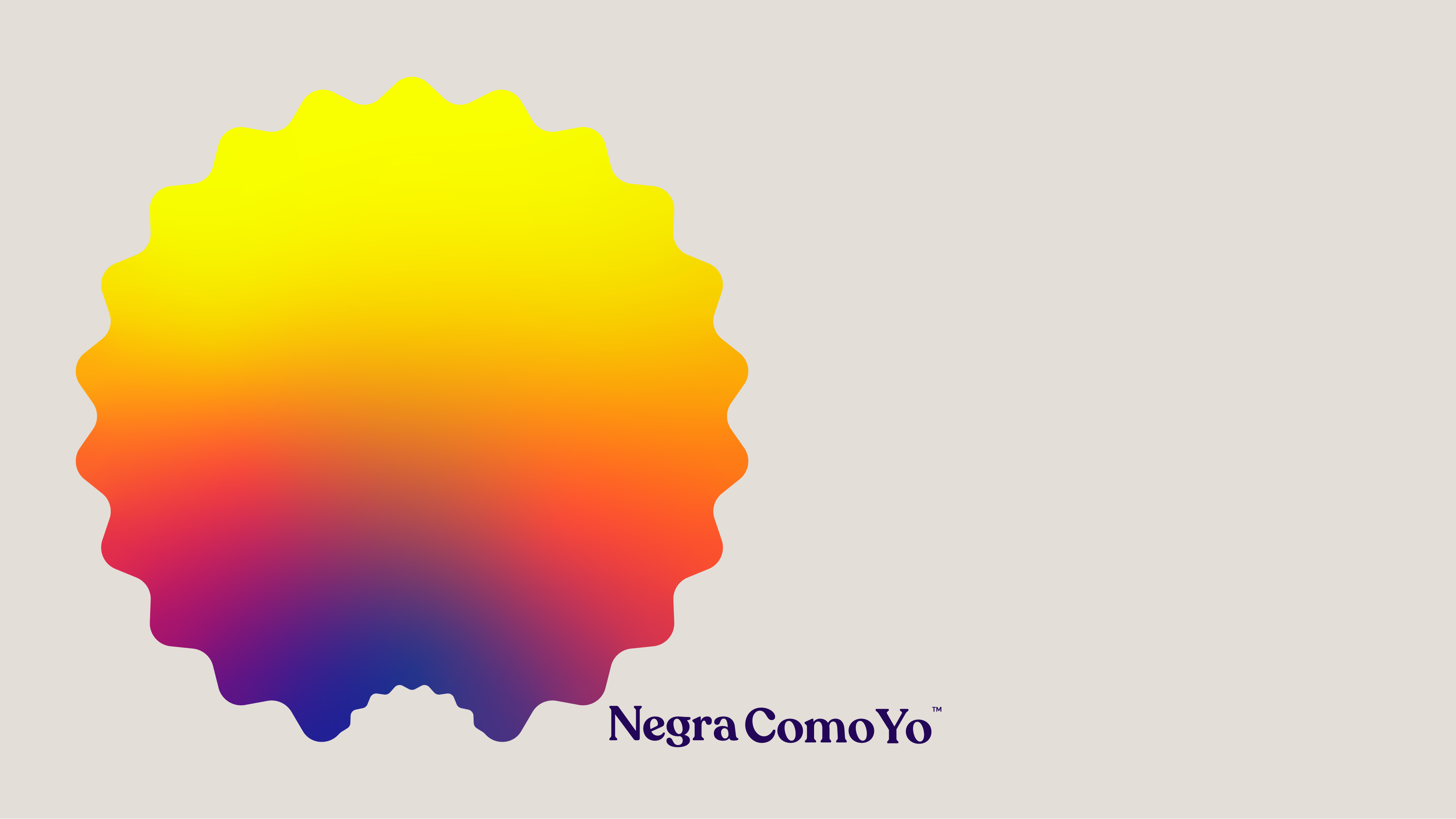
Introducing a reimagined and flexible visual identity for the Negra Como Yo podcast – a distinct platform dedicated to celebrating and promoting Latin American blackness. The rebranding is grounded in the powerful concept of embracing our roots, using this unique foundation to forge a strong sense of identity.
For the Negra Como Yo rebrand, we opted for a profound and personal transformation, delving deeper into the connections between individual and community identities. This process acknowledges the hybridization of traditions and cultures, generating new elements and fostering exchanges across cultural lines.
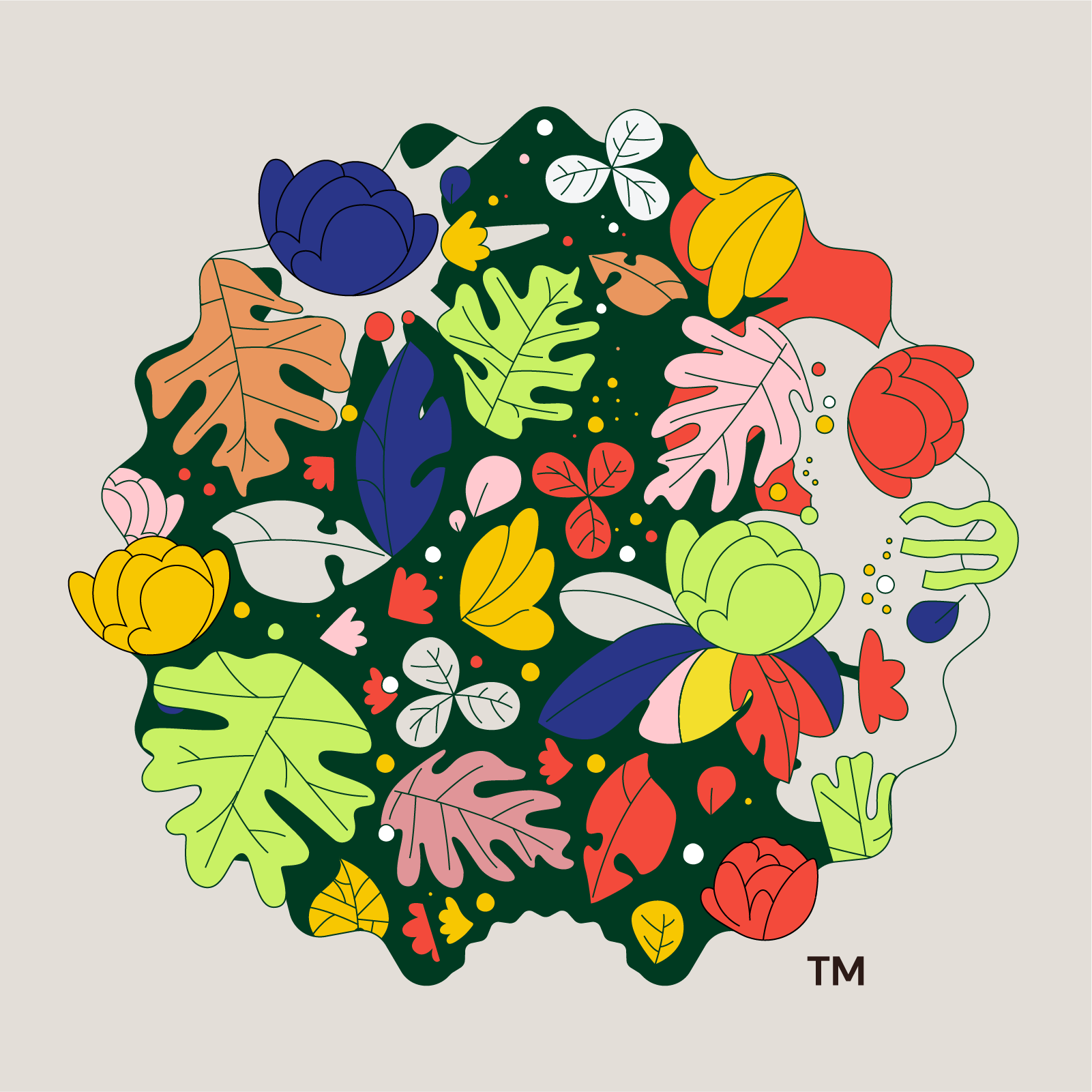
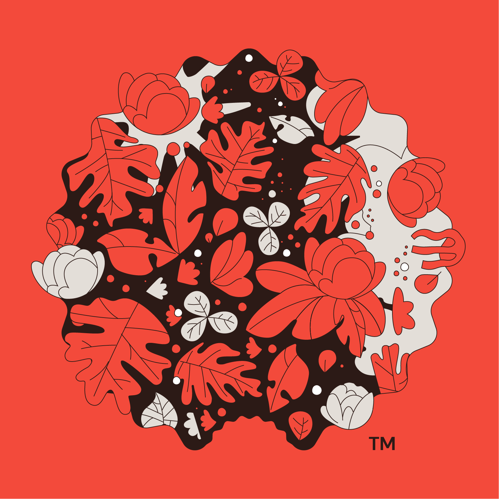
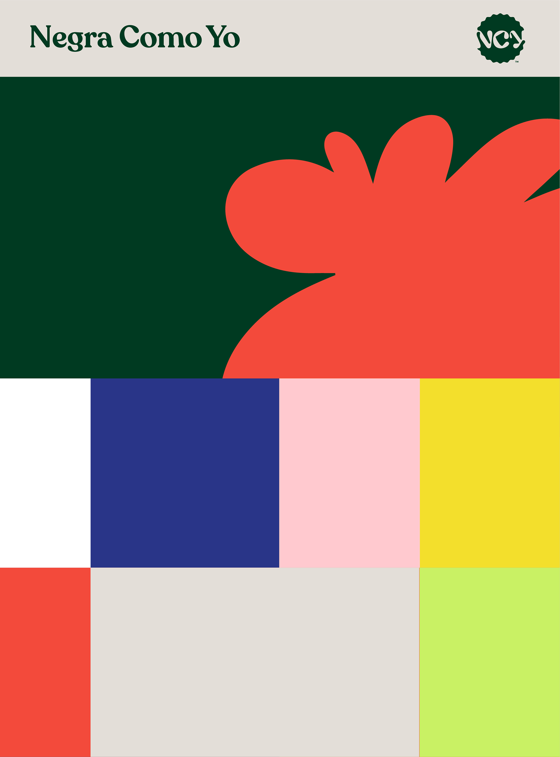
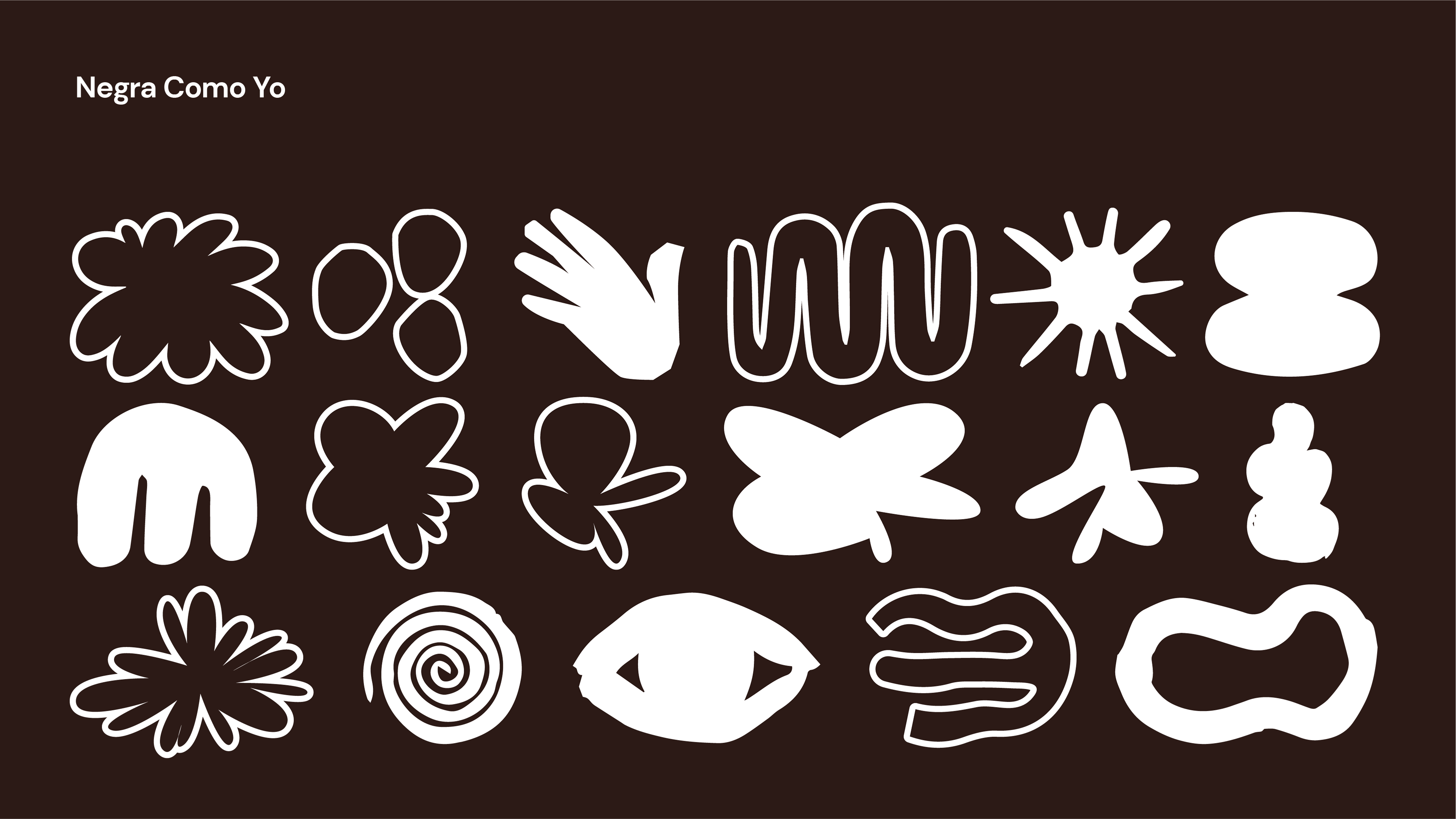
Drawing inspiration from the Baobab flower, the rebrand incorporates abstract forms reminiscent of African rubber stamps, creating a cohesive set of values that embody the essence of Negra Como Yo. The new branding, aptly named "Roots," features a vibrant, bold, and modern color palette, while maintaining its Afro-Latinx and human-centric focus. The striking contrast ensures the message is communicated in a fresh and inventive manner.