Escaparate: Highlighting Marketplace Content Through UI
A UI design project for Escaparate, focused on defining a clear and expressive visual language for an Android-based app through color hierarchy, hand-drawn illustrations, and a modern card-driven interface.
Logo design: by client
Logo design: by client
Services: Art Direction, UI Design
The Problem
Escaparate required a digital interface capable of presenting content in a clear and engaging way while maintaining a strong visual personality. The challenge was to avoid a generic app aesthetic and instead create an interface that felt distinctive, approachable, and easy to navigate within an Android environment.
The Challenge
The main challenge was to design a UI system that could:
- Clearly highlight key content and actions
- Balance expressive visuals with functional clarity
- Feel modern without becoming visually noisy
- Work natively within Android UI patterns while maintaining a unique identity
- Clearly highlight key content and actions
- Balance expressive visuals with functional clarity
- Feel modern without becoming visually noisy
- Work natively within Android UI patterns while maintaining a unique identity
The interface needed to communicate hierarchy instantly while remaining flexible and scalable.
The Solution
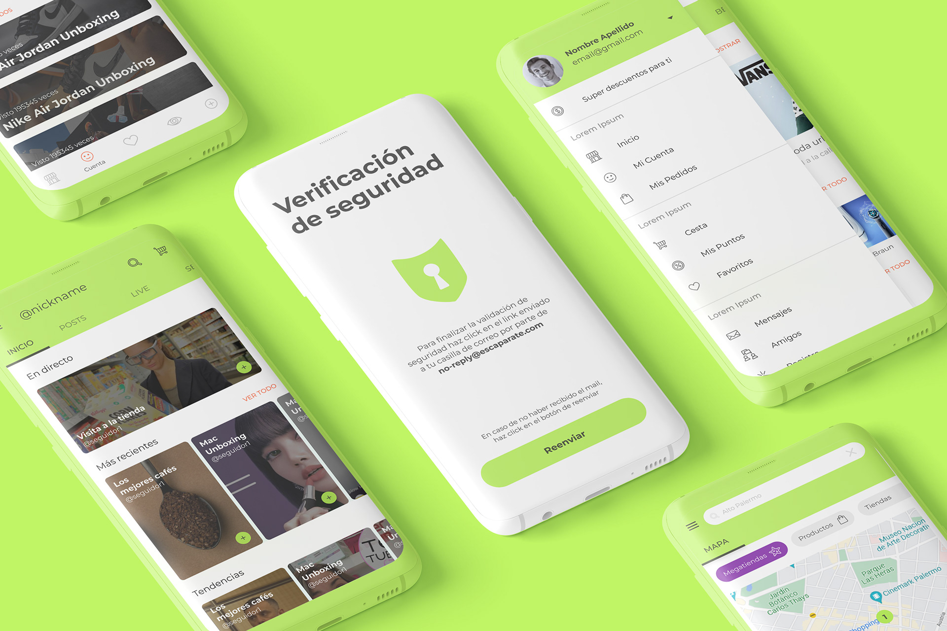
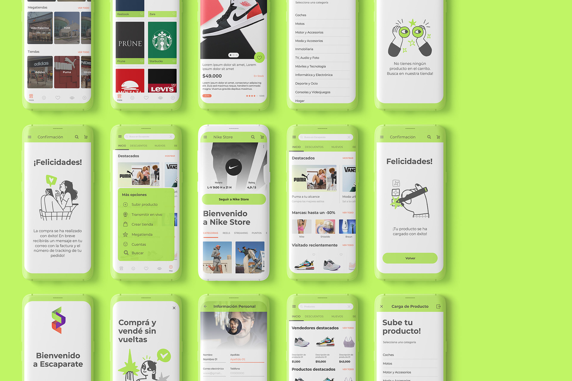
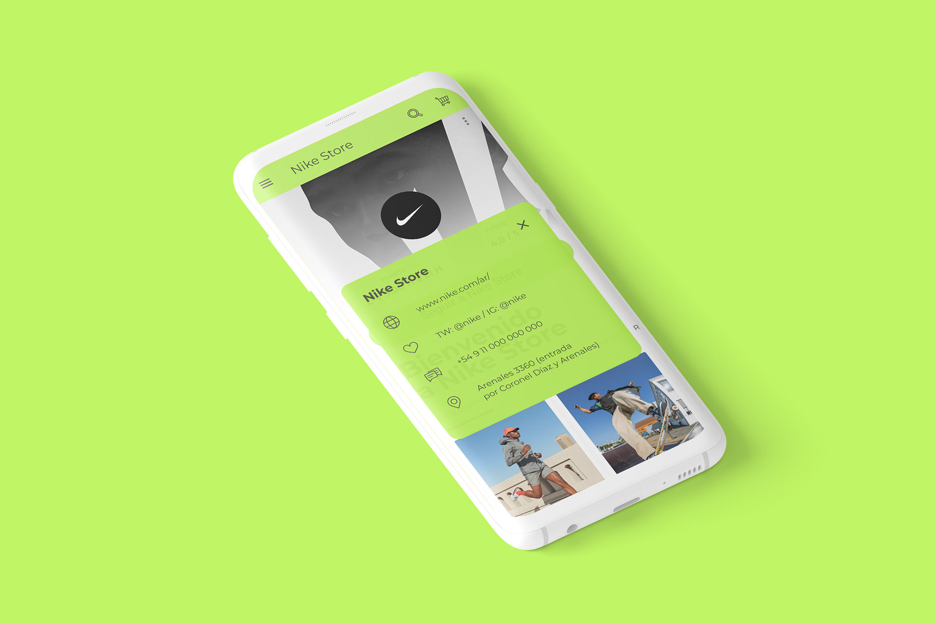
The UI was built around a modern card-based design system, allowing content to be grouped, scanned, and interacted with efficiently. Cards became the core structural unit of the interface, providing consistency across screens and supporting modular growth.
A distinctive green highlight from the logo was introduced as a key accent color to guide attention and reinforce brand recognition. This highlight color was used selectively to emphasize primary actions and important information without overwhelming the interface.
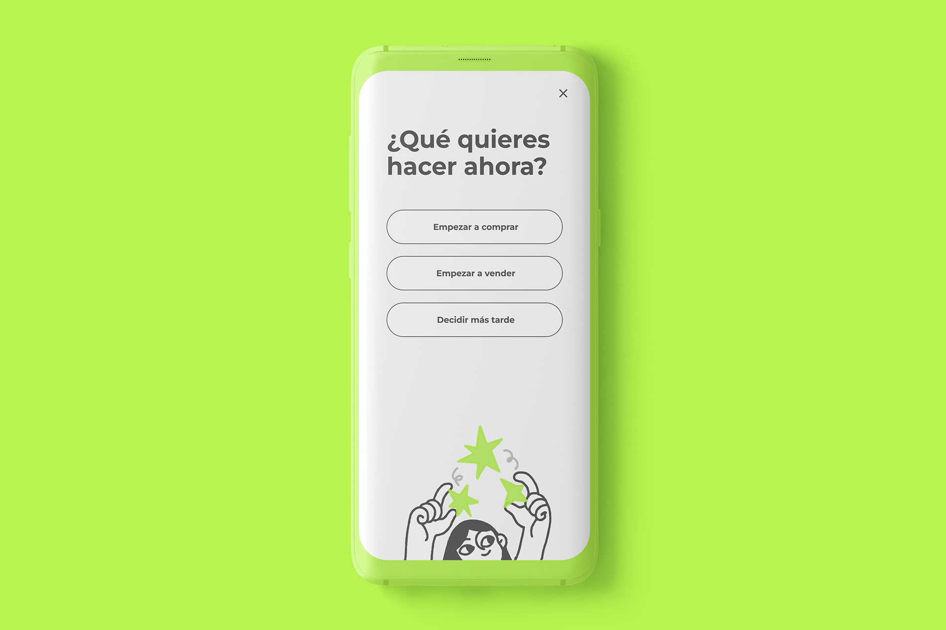
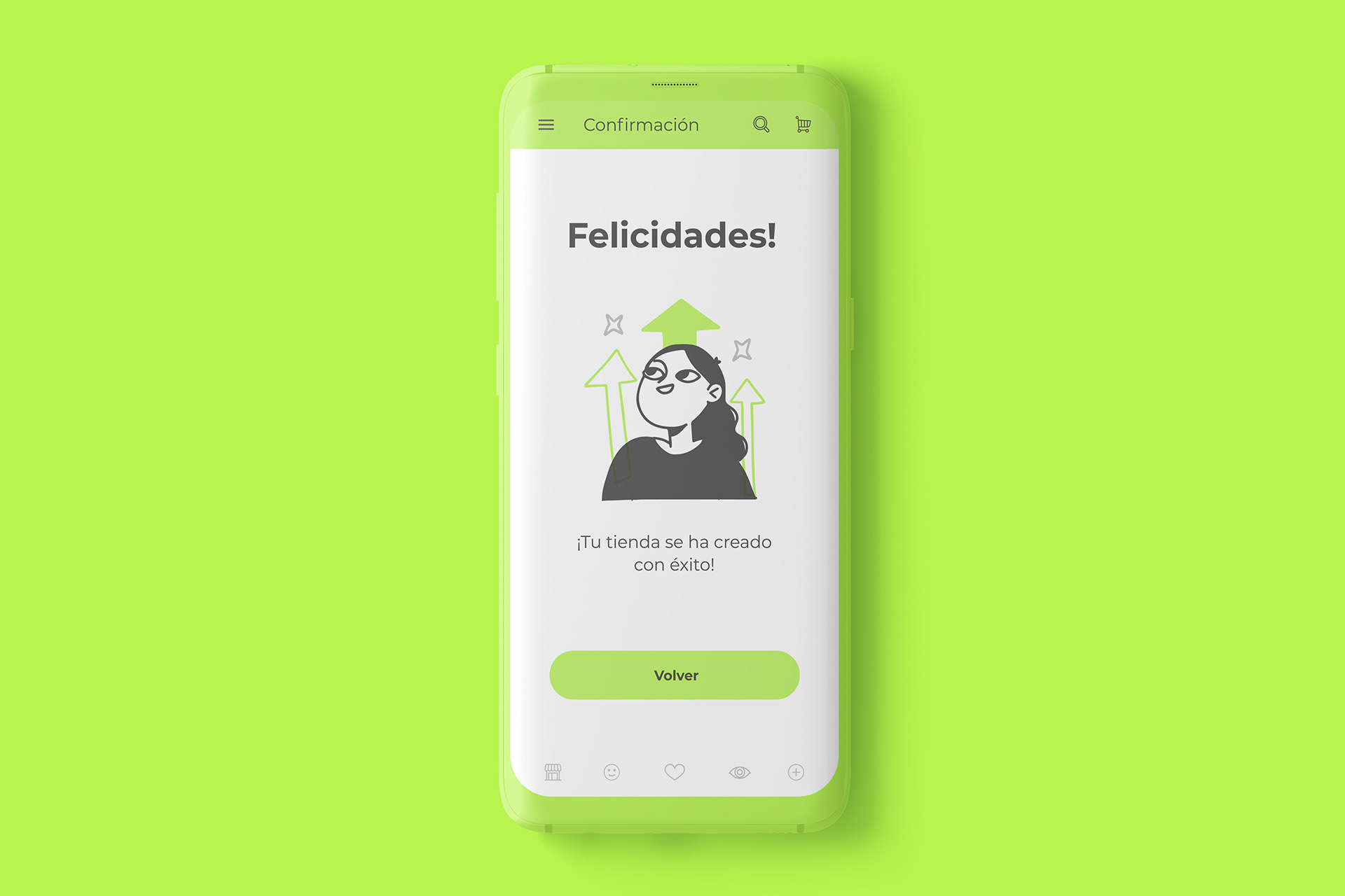
Hand-drawn illustrations were incorporated to add warmth and personality, creating contrast against the structured card layouts and reinforcing a more human, approachable tone.
The design was developed with an Android-first mindset, respecting platform conventions while applying a custom visual layer that enhanced usability and visual coherence.
Outcome
The resulting interface delivers a clear, recognizable UI system that combines structure and character. Content is easy to scan, actions are clearly highlighted, and the overall experience feels modern, friendly, and intentional.